Whitespace isn’t empty
Content warning: this blog post contains 2 visual illusions which may affect you if you have a sight impairment or a condition like photosensitive epilepsy, migraines, vertigo, or vestibular disorders. They are the first two images on the left of the page near the top of this article, so I want to give you a chance to cover them/skip past if you don’t want to see them. The tool I use to publish this blog is basic at best, and I can’t find a way to hide them.
As a designer, understanding the importance of whitespace as a visual tool is non-negotiable, but it’s an often fought-over topic in organisations. Often stakeholders will want to reduce whitespace and use every inch of the page, and designers want the opposite: to increase whitespace and maintain a visual balance. That’s because designers understand that Whitespace - or negative space - is actually the unsung hero that allows content to breathe, offering clarity, focus, and impact.
A number of chance encounters, happenings and ‘lightbulb moments’ over the past year or so have widened my view of what whitespace is, and the value it can bring to not only design but life too.
Seeing != Perception
The way humans work is really interesting. What our eyes see, and what our brain perceives are not the same thing. What our eyes see are a bunch of lines and shapes which may or may not be related to each other. But our brains do something different - they interpret that signal from the eyes into something that makes sense to us. Our brains have to do this to make sense of life, without becoming overloaded by the constant stream of input we take in.
Take this illusion for example - there are no dots between the squares, your eyes are not seeing actual dots, but your brain is placing them there and that is your perception:
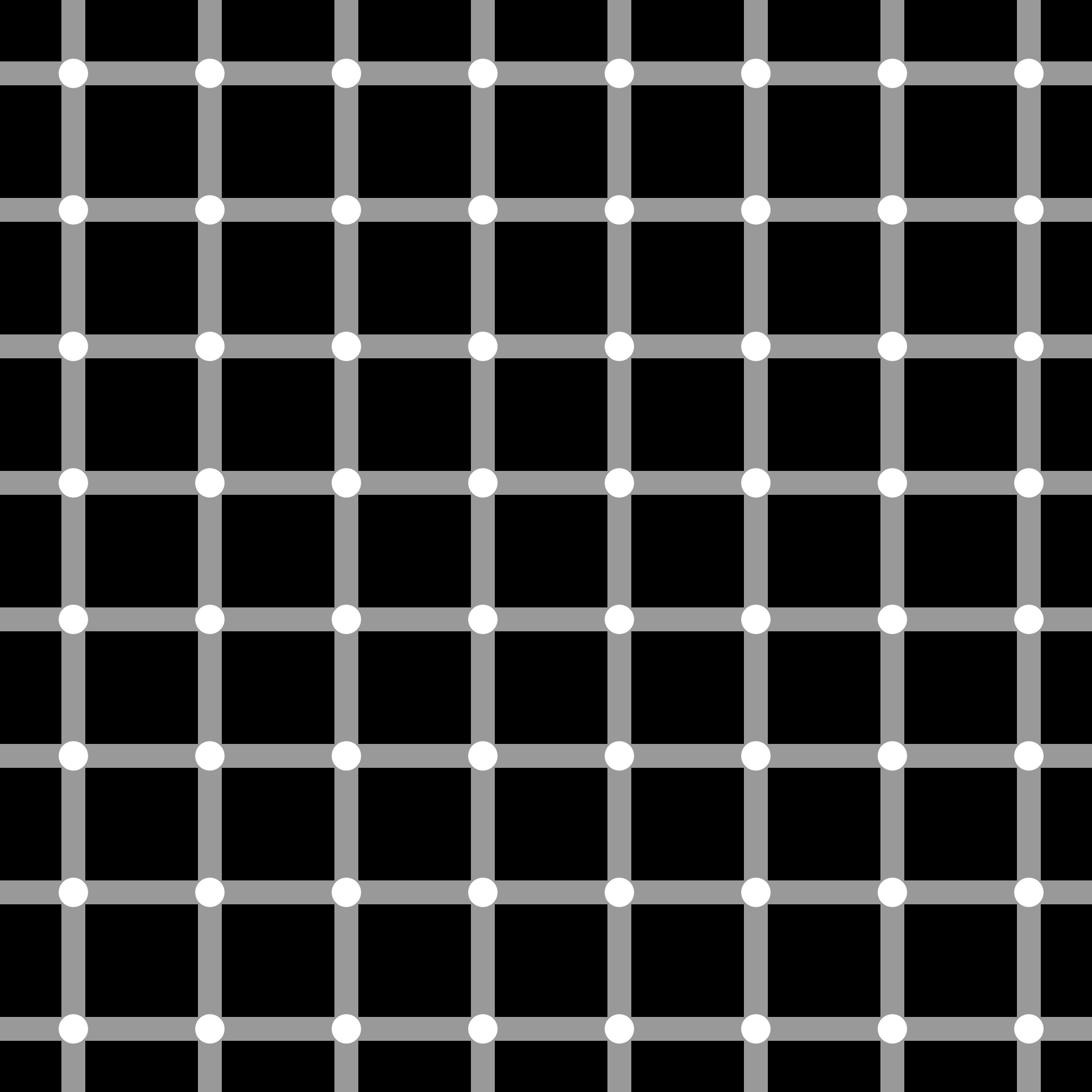
The scintillating grid illusion triggers the brain to see dark spots that don't exist. Our brains do their best to make sense of this information, and make a guess at what might be in the gaps.
Image credit: Tó campos1, Public domain, via Wikimedia Commons
Similarly with the Kanizsa Square below - there is no square! Because of the shapes in black, our brain has interpreted what is physically there and told you there is a white square. Our brains are very clever at filling in the gaps and inventing what it thinks should go there, and this is a really good example.

The Kanizsa Square - spoiler, there is no square!
Surprisingly, the illusion can also be seen by cats, showing we perceive light and dark areas the same as our feline friends.
Image courtesy of ResearchGate.
Objects and Space
This interplay between objects and space is really important for anyone designing digital products, because what we do AND don’t put on the page for users to see isn’t always what their brain will interpret or perceive it to be. It takes a good understanding of these laws of visual perception - Gestalt Psychology - to ensure you’re designing something that not only works for the eye, but the brain too. Whitespace forms a huge part of that visual experience, as you can see from the examples above.
I’m not going to deep dive on this, but it’s useful to know that the laws of Gestalt Psychology mean we see “wholes” first rather than parts - and that is why you see these little quirks between what is on the page or screen versus what your brain understands it to be. This is an evolutionary shortcut our brain takes to ensure our survival. Imagine being in the wilderness in Africa and instead of seeing a ‘whole’ animal in front of you, you see the parts first: a paw, a tail, a mane, some rather large gleaming eyes, and - uh oh! Is that a Lion? …too late! Our brains see ‘wholes’ because it helps us make sense of the world at a rapid pace, and there are obvious benefits to it working this way instead of being more like a slow and analytical engine (Benefits like not getting eaten).

The infamous Bulk Rename Utility App. Who needs whitespace - just utilise every bit of screen estate possible, what could go wrong? Image credit Luis Berumen Castro
Not just visual
A couple of years ago I had the privilege of visiting Japan and became aware of a concept they have called “Ma”:
Ma (pronounced “maah”) — is the pure, and indeed, essential void between all things. It is the essence of Japanese aesthetic, the DNA of its design principles. Ma is all about space that holds potential. In Kabuki, traditional theatre, it is intuitive as practice. Ma is in the purposeful pauses in speech which make words stand out. It is in the quiet time we all need to make our busy lives meaningful, and in the silence between the notes which make the music. Ma takes its inspiration from nature. - The spaces in between are everything, by Alan Moore
When I first encountered this idea, it resonated deeply with me—not just in a practical sense at work, but also on a more personal level. When I started learning to read music I found I paid a lot of attention to the notes and where the sound is, rather than where it isn’t, and I tended to neglect the “rests” in the notation (pauses in the music - where there is no sound). But neglecting where there isn’t sound completely changes the melody, making it a completely different piece of music. Those seemingly ‘empty’ spaces aren’t empty at all—they’re essential to the music itself. The absence of sound is just as much a part of the whole as the notes that are played.
Alan’s article also talks about designing space into the products and services he builds, especially his books. Imagine a book with no chapters and written as one long paragraph - it would feel entirely different. I think it’s a common problem that we sometimes take the spaces out - rather than work out where a useful pause might go. I often find in public services the pauses are all in the wrong place. Think long waits to receive a hospital letter so that the recipient misses the appointment it details. Would a better bit of design be to take out long waits and onerous processes, and allow longer appointments for patients to ask questions, or time with support services to get comfort after bad news? The ‘music’ of services can often be discordant, and we need to do some work on our arrangement of the whole piece.
…Pots are formed from clay,
though the space inside them is the essence of the pot… (Alan Moore)
Ma in nature
I also like that the concept of Ma takes it’s inspiration from nature, and the famous gardener Monty Don has also connected the concept of Ma to gardening in his writing - with the hedges and spaces between gardens and plants just as important as the beds and plants in them. Without that separation everything runs into each other, it’s chaos. You can’t appreciate the bits between the gaps, if there is no space in between. Nowhere is this concept more evident than in the beautiful gardens of the French Chateaux:

Châteaux Villandry’s exquisite formal gardens are a gardeners paradise. Hedges and separation is essential to know where one thing ends and another begins. Photo credit to AXP Photography.
To me, this verges on the notion of stewardship, seeing the whole big picture, and curating gaps to make sense of that whole. That could be in anything - be it a garden, your calendar, or music - is an automatic and purposeful recognition of protecting - or stewarding - something important. That could be a special flower, an important piece of work, the melody, or indeed a service, product, or website (and by extension the people that use it).
Organisational Whitespace
Over the last few years I’ve attended multiple GDS staff away days and realised that this was a really interesting piece of “organisational whitespace”, a margin or gap between “the work”. It’s quite common (regardless of the organisation) for people to worry about taking this time out from the daily activities of their jobs as “not really worth my time” or “not productive” but that thinking is a trap. Organisation whitespace is a chance to stand back and take stock of “the work”, but also to connect with others and see the whole.
We need these times to step back from what we’re doing and gain some perspective and connection to the work itself, to be good at the work. Personally I found it useful to speak to people I’d not seen in a while, agree to follow up chats and to work on various things together in future.
Reflection as leadership whitespace
I think another useful piece of “life whitespace” is the time you can take to reflect, especially if you’re a leader.
“…quality reflection is not escapism or romanticism. It is crucial to good leadership. It reminds us of our values and encourages us to live them. It creates an internal space in which we become clearer about the contribution we can make in a given situation. This is how a leader can make a difference.” - Alan Smith and Peter Shaw
The seduction of being busy, of delivering and always ‘on’ is huge these days, but the previous quote from Alan and Peter rejects that culture in favour of one where gaps, space and that time to reflect is what will make you go faster. Sometimes you have to stand still to speed up.
Another aspect of “leadership whitespace” is listening. I try to practice listening more than I talk - this wasn’t always the case at the start of my career when I thought silences were for filling and talking showed intelligence. These days I lean into shutting up. You learn a lot more, and you forge brilliant, trusting relationships when you give that space to others. Listen more, hear more.
Empty doesn’t mean nothing
I know I’ve moved all over the place in this post, we’ve gone from the way our eyes and brains work, to music, government services, gardening, theatre, leadership and company get-togethers. They’re all really different topics, but the common thread is that all of them work better with negative space purposefully designed in.
Without whitespace our lives would be chaos. We wouldn’t be able to make sense of things - visually or cognitively. Embracing the "empty" can lead to deeper meaning and greater fulfilment - in both a philosophical but also practical and tangible sense. By intentionally creating moments of stillness, silence, and openness, we give ourselves the room to reflect, grow, and connect with what truly matters and rediscover our priorities in a cluttered world.
It’s time to shift our focus from the noise to the quiet spaces in between, because in both design and life, what we leave out can be just as important as what we put in.